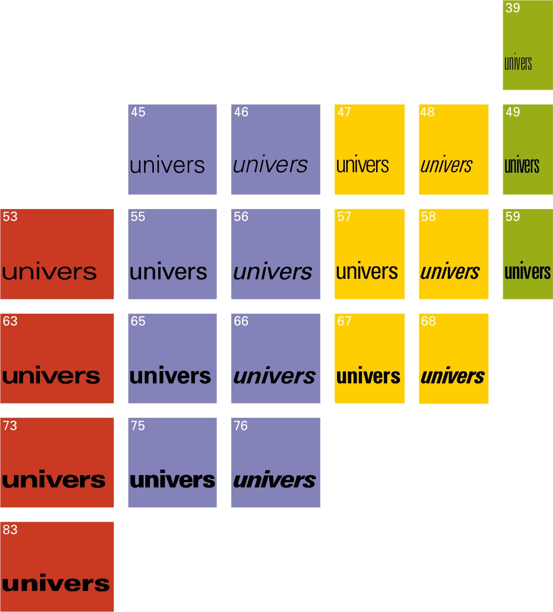
Univers, along with the systematic thinking it embodied, has had lasting influence on typography. It essentially established the large, unified typeface 'superfamily' as a standard in design, which guided the industry towards planned and coherent systems and away from typeface family expansions that grew over time. This logical numbering system became a model for classifying styles which impacted type, particularly with the birth of extensive digital font libraries. The widespread success and adoption of Univers, especially in corporate identities and major signage systems, demonstrated the effectiveness of a rational, legible, and versatile sans-serif family.
It became a cornerstone of the International Typographic Style, setting a high standard for clarity and neutrality, although Frutiger incorporated subtle visual refinements that went against total geometric rigidity. It was this balance between clarity and optical sensitivity—being "more contemporary, nearer to the roman"—that influenced numerous subsequent sans-serif designs which sought similar performance. While Univers was often compared with Helvetica, Frutiger viewed them differently. Helvetica, to Frutiger, served as the “blue jeans” typeface, a “typeface for mass culture”, while Univers provided a more "delicate and harmonious" system. Univers’s long-lasting influence is further proven by Linotype commissioning Frutiger to oversee its redesign as New Univers decades later. Ultimately, Univers shaped modern typography not just by providing a highly functional tool, but also by offering a framework for managing visual complexity across many communication contexts.
Univers, introduced in 1957, is a prominent sans-serif typeface valued for its clarity, neutrality, and pioneering family structure. Classified as a neo-grotesque, Univers refined earlier grotesques like Akzidenz-Grotesk (Frutiger’s inspiration for Univers) through greater visual subtlety and systematic integration across weights and widths. General characteristics of Univers include geometric shapes, larger counters and eyes. Frutiger intentionally, however, avoided pure geometric construction and instead incorporated optical adjustments. These include a low stroke weight—slight variations in stroke weight (horizontal strokes are subtly thinner than vertical strokes)— and thinning where curves meet stems. These refinements enhance visual harmony and improve the overall readability compared to more rigid predecessors, which give the forms a more organic feel and make them better suited for legibility.
Specific letterforms contribute significantly to Univers's legibility and character. Univers uses a two-storey “a” and a single-storey “g”. The apertures in curved letters, like “a”, “c”, “e”, and “s”, are relatively open, this improves character distinction and prevents forms from closing up visually which is crucial for maintaining readability, especially at smaller text sizes. Stroke terminals are clean cut and perpendicular to the stroke direction, such as in the lowercase “t”. Unique to Univers, the uppercase “Q” also possesses an interesting visual quality with its horizontal tail. Furthermore, its moderate-to-high x-height ensures lowercase letters are prominent and clear, balancing well with capitals and contributing to body text legibility.
Visually, the Univers family demonstrates a considerable, yet controlled, range in both stroke weight and character width. Despite such variation in weight and width, the core letter structures and proportions remain consistent. Condensed and extended styles modify horizontal dimensions while preserving the fundamental character shapes and alignments. This visual consistency across the entire system is a key attribute and is what has allowed designers to combine different weights and widths within a single layout for information hierarchy without causing visual disruption. The overall impression of the Univers typeface is one of refined functionality through disciplined, systematic variation.